The print magazine Sport in Art has achieved significant international recognition by winning the prestigious Red Dot Award for Communication Design. It is only the second Czech periodical to receive this award in the Publishing & Print Media category. The jury was particularly impressed by the innovative approach to combining sport and art, as well as the unique graphic style that sets the magazine apart from the competition. We spoke with Art Director Milan Nedvěd, whose vision is behind this success.
Congratulations on winning the Red Dot Award! What does it mean to you? Are you happy about it?
I am. Just like with any award. Even though I’m already working on something new, it’s always nice to look back and have confirmation that I made the right decisions. Besides, you don't win a Red Dot every day, so this one brings a bit more joy."
Why do you think your design won?
If I knew the answer to that, I’d be winning awards left and right. I’d say the jury appreciated the connection between sport and art within a striking typographic system. It draws from the conservative, almost academic style of art magazines but isn’t afraid to break that system, introducing dynamism and a creative touch that makes the content more appealing to readers of a lifestyle magazine.
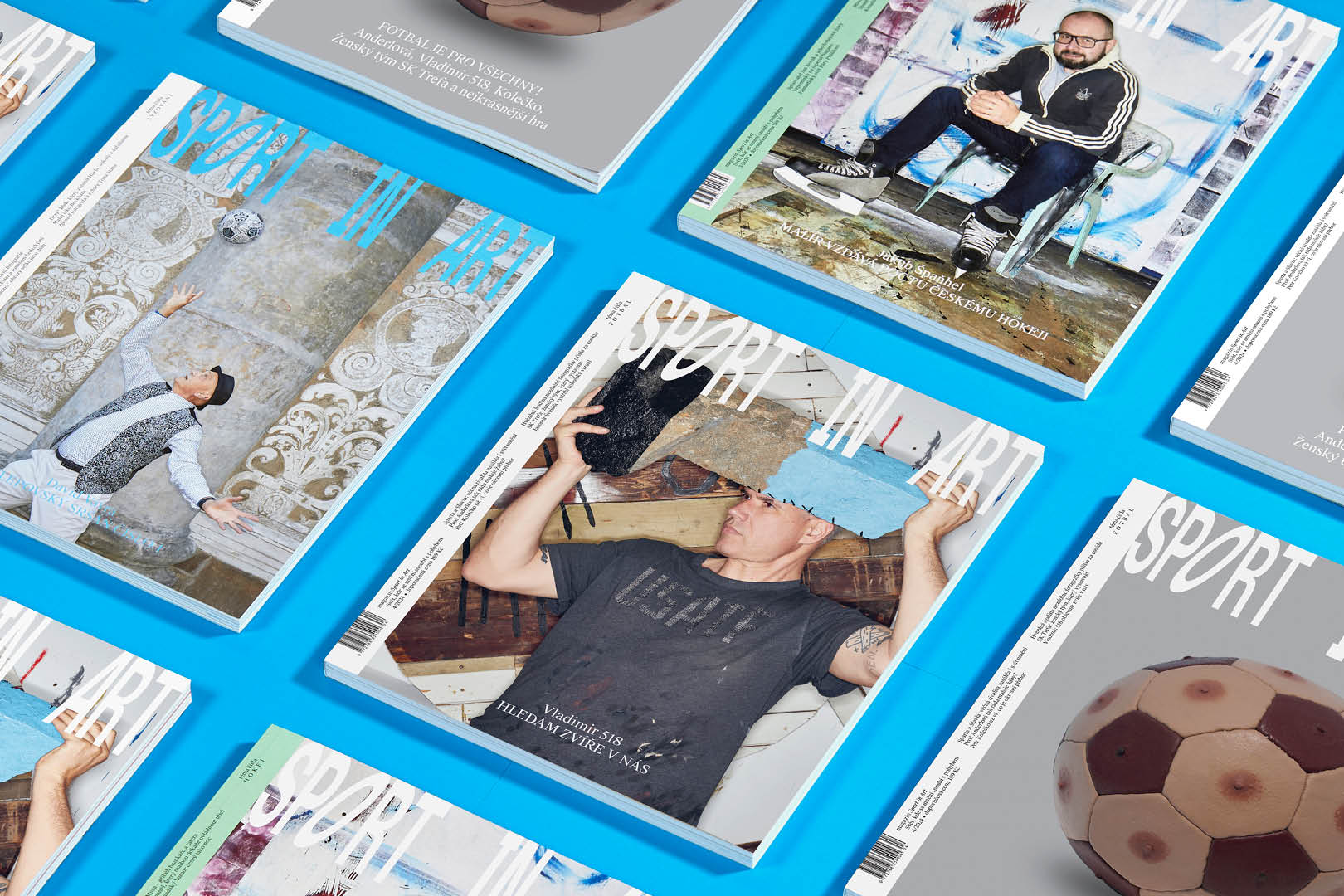
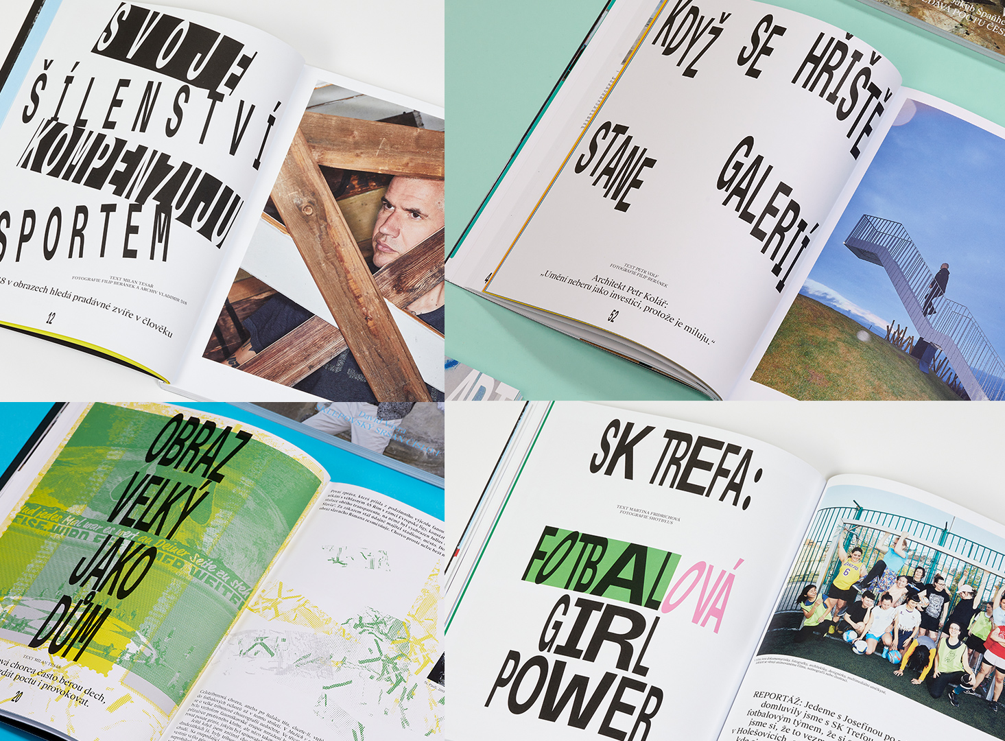
Take a closer look at Sport in Art Magazine and order it from our e-shop.
Sport in Art Magazine had its graphic manual when you first received it, but you completely revamped it and created a whole new look. I’m curious about your thought process: How did you approach this? Why did you choose this particular typography?
Well, I didn’t like it at all. It didn’t inspire me in any way. I couldn’t imagine building a magazine on the original typefaces. Typography and imagery need to resonate together. When I imagined the kind of photos that could be created, how the magazine could be airy and typographically confident, it became clear that using the existing graphic manual would result in a completely different art direction, and I didn’t want to be part of that. So I decided to take the risk, throw it out, and do it my way. As I always do. After all, what’s the worst that could happen? It might not be approved.
„
When talking about trends, I often recall that sometimes it's more contemporary to be non-contemporary.
The result is a bold design that makes the magazine stand out. What is the key essence that differentiates it from other magazines?
I think it’s because Sport in Art Magazine doesn’t fit into any specific categories. There are dozens of generic magazines that blend together through their (not just) design. Here, each article is tailored to its message and content. The typography interacts with the photography or, in other places, with the article headlines. Thanks to the collaboration with great photographers, we produce original visual material, and I believe readers will notice this and nod in appreciation.
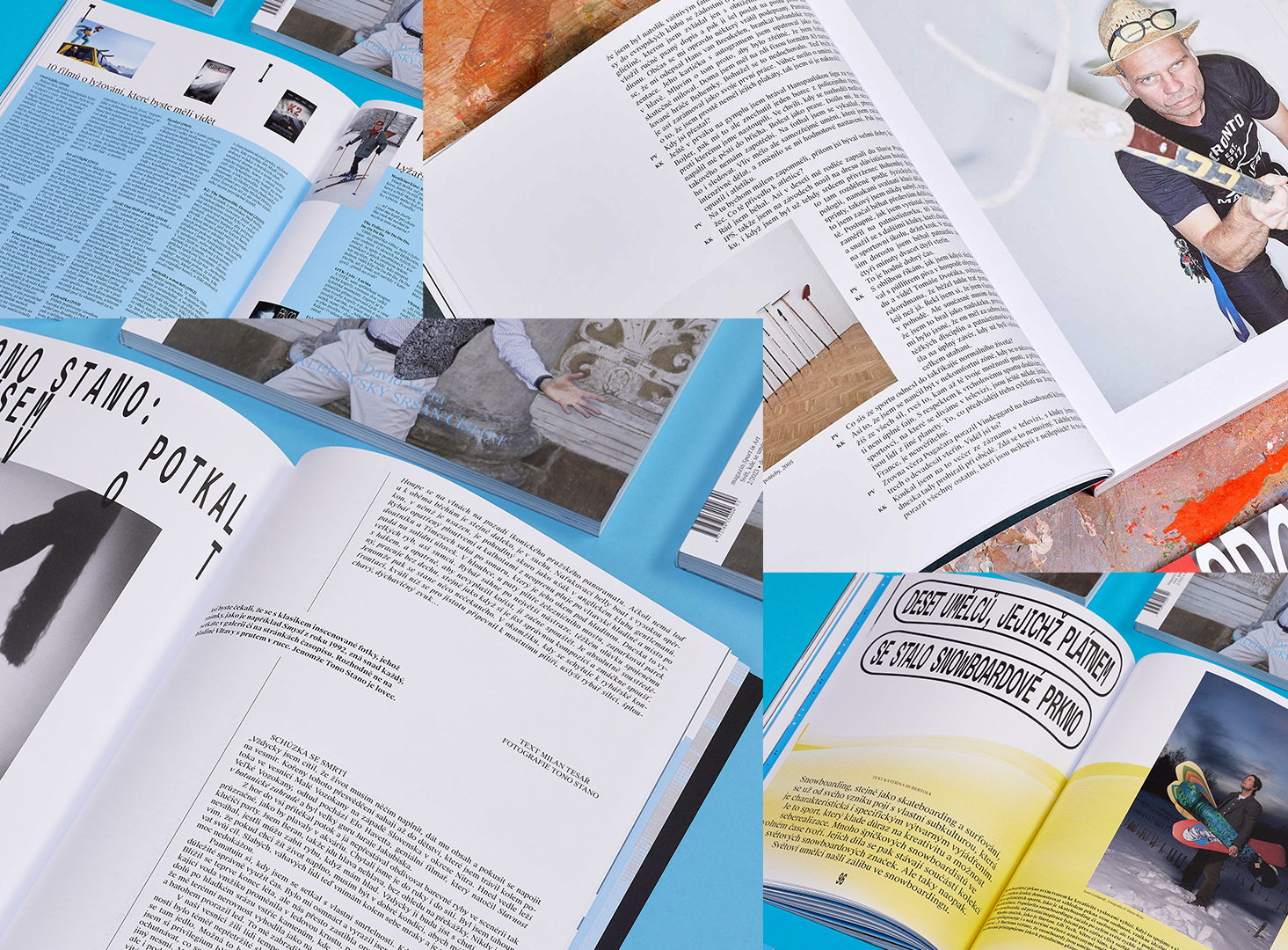
Regarding bravery, do you think you gained it during your studies in America, which is why your work seems so confident? You were the first Czech graduate in Graphic Design from the renowned Rhode Island School of Design (RISD).
I wouldn’t say it’s confidence. At school, I remember discussions about radical graphic designers and their artistic and typographic gestures. We had the chance to spend weekend workshops with some of them. I was always fascinated by their perspective. The term ‘radical’ might have negative connotations, but to me, they seemed completely rational in their decision-making – and with a smile on their faces! I told myself that’s where I wanted to be mentally. Of course, it's years of experience and craftsmanship, but there was also a significant dose of perspective, which I think most graphic designers lack. It stayed with me to avoid over-intellectualizing graphic design, which was quite at odds with the very strict academic environment. So, not confident, but definitely aware of what I’m doing and doing it the way I want because that’s who I am and no one else.
Did you enjoy building the design around the intersection of sport and art?
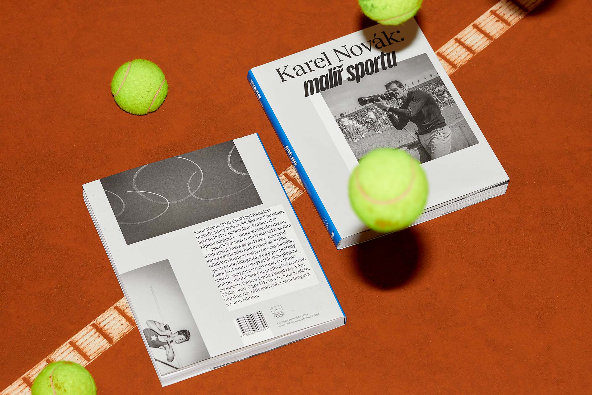
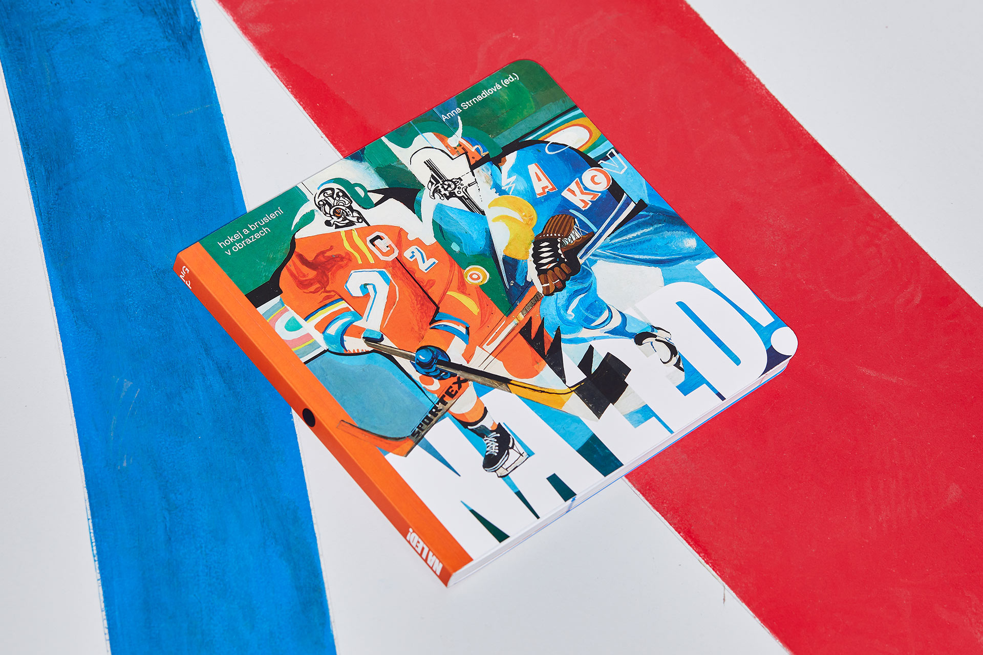
I had already explored this before, so there was a foundation to build on. My first experience was working with photographer Zdeněk Lhoták on the project ‘Tenkrát na Spartě,’ and soon after, on his legendary series ‘Spartakiáda,’ which won a World Press Photo in 1986. This was followed by collaboration with the Czech Olympic Committee on the book by sports photographer Karel Novák: ‘Malíř sportu,’ which also won acclaim at the Most Beautiful Book in the World competition this year. Although these books share a central theme, they are very different: reportage, nude, documentary. In the magazine, all these elements come together, and the chosen art direction for the entire magazine continues to offer me ways to work with various topics without repeating myself. It allows me to switch between being ‘art’ and being ‘sport.’
Graphic design is constantly evolving. Where do you find inspiration? Do you follow trends?
I don’t follow trends. Trends are like a crutch for graphic designers who need to quickly please. When talking about trends, I often think that sometimes it's more contemporary to be non-contemporary. However, I do pay attention to trends in a broader context—across other visual media such as photography, film, fine art, architecture, fashion, and technology. That’s where ideas form, actions and reactions occur, and everything influences and defines each other. From that, movements can emerge that lead to new typefaces, which are more significant for typography than mere graphic decoration.
Art is something where you seem to feel at home—you’ve won numerous awards for designing art books both in the Czech Republic and abroad. You’ve long collaborated with independent publishers, cultural and gallery institutions, and figures from the Czech art scene. Did you always want to work in this field, or was it a snowball effect, with art projects gradually piling up?
Initially, I wanted to leave the digital medium behind. Before RISD, I spent several years working as a UI/UX designer. We worked on early banking systems for large multinational banks, web presentations for top 100 companies, and online campaigns. Later, in London, we worked with international clients. But I grew tired of it. The digital medium is intangible and has a short lifespan, especially in the commercial sector. School opened my eyes to this. I naturally transitioned to more traditional forms—those with a longer lifespan that are created more slowly, carefully, and thoughtfully. Practically, it was a coincidence that led me to collaborate on the first book ‘Slečna’ with photographer Dita Pepe. And lo and behold, over the years, I’ve worked on numerous other photographic publications. From there, it was a small step to working with artists, galleries, and collectors.
.jpg)
I’ve asked about art, but I still need to ask about sports. It’s known that you’re a fan of Sparta; do you ever play football yourself?
Not at all. Back in middle school, I was a good and promising goalkeeper. I used to train on the cinder pitches of Viktoria Žižkov. But I didn’t enjoy the team aspect and the collective nature of it, so I gave it up. We had Tomáš Rosický at our school, and he managed to make football quite unappealing for us all. So I preferred playing chess, tennis, or ping-pong instead.
Your wife Josefína, who heads the Art Grand Slam exhibition project, collaborated with Sport in Art even before you did. Is this something you discuss at home before bed?
We both keep work at work, so outside of office hours, we focus on more important things. It’s a good recipe for maintaining a fresh work mindset and a happy marriage.
You can find Milan Nedvěd’s work on his website: https://mnmnmnmn.studio/.


